Rachel Kidwell

UMBC class of 2022
Environmental Science and Geography (B.S.)
Geographic Information Science (Certificate)
Load in Relevant packages.
library(tidycensus)
library(tidyverse)
library(tigris)
library(sf)
library(patchwork)
library(crsuggest)
library(mapview)
library(tmap)
library(spdep)
library(ggplot2)
readRenviron("~/.Renviron")
Obtain ethnicity data in Pennsylvania by census tract and summarize by total population. Include geometry for later mapping. Filter to only Asian.
PA_race <- get_acs(
  geography = "tract",
  state = "PA",
  variables = c(White = "B03002_003",
                Black = "B03002_004",
                Native = "B03002_005",
                Asian = "B03002_006",
                Hispanic = "B03002_012"),
  summary_var = "B03002_001",
  geometry = TRUE
)

PA_asian <- filter(PA_race, variable == "Asian")
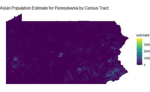
Map the initial values representing occurrence of Asians in Pennsylvania by tract.
ggplot(PA_asian) +
  geom_sf(aes(fill = estimate), color = NA) +
  scale_fill_viridis_c() +
  theme_void() +
  labs(title= "Asian Population Estimate for Pennsylvania by Census Tract")

Establish nearest neighbor analysis with queen arrangement allowed. Define centroids and coordinates for each tract.
PA_asian_new<-PA_asian[!st_is_empty(PA_asian),]
neighbors <- poly2nb(PA_asian_new, queen = TRUE)

pa_coords <- PA_asian_new %>%
  st_centroid() %>%
  st_coordinates()
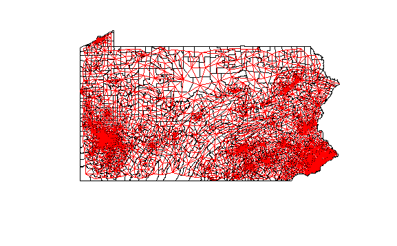
Map the tracts’ connections to neighbors. Do not include centroid points.
plot(PA_asian_new$geometry) +
plot(neighbors,
     coords = pa_coords,
     add = TRUE,
     col = "red",
     points = FALSE)

Assign weights to neighbors and verify the weights were applied equally.
weights <- nb2listw(neighbors, style = "W")
weights$weights[[1]]
Include self in weights.
localg_weights <- nb2listw(include.self(neighbors))
Calculate the Getis-Ord local Gi* statistic.
PA_asian_new$localG <- localG(PA_asian_new$estimate, localg_weights)
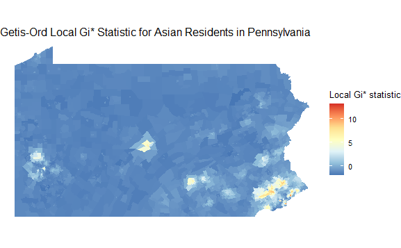
Map the Gi* statistic for each tract.
ggplot(PA_asian_new) +
  geom_sf(aes(fill = localG), color = NA) +
  scale_fill_distiller(palette = "RdYlBu") +
  theme_void() +
  labs(fill = "Local Gi* statistic", title="Getis-Ord Local Gi* Statistic for Asian Residents in Pennsylvania")

Hotspot analysis:
Define levels for clustering and mutate the data.
asianhotspot <- PA_asian_new %>%
  mutate(hotspot = case_when(
    localG >= 2.56 ~ "High cluster",
    localG <= -2.56 ~ "Low cluster",
    TRUE ~ "Not significant"
  ))
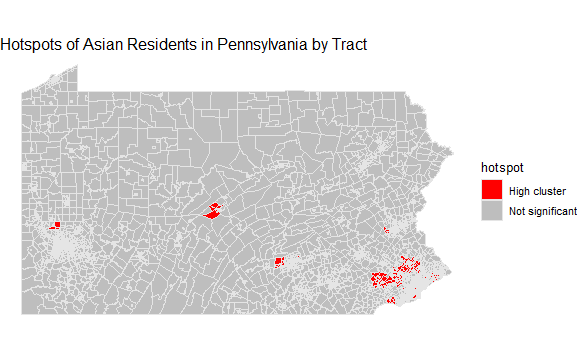
Map the hotspots.
Note: no tracts in my data qualified as ‘low cluster’, so the color specification is absent.
ggplot(asianhotspot) +
  geom_sf(aes(fill = hotspot), color = "grey90", size = 0.1) +
  scale_fill_manual(values = c("red", "grey")) +
  theme_void() +
  labs(title= "Hotspots of Asian Residents in Pennsylvania by Tract")
